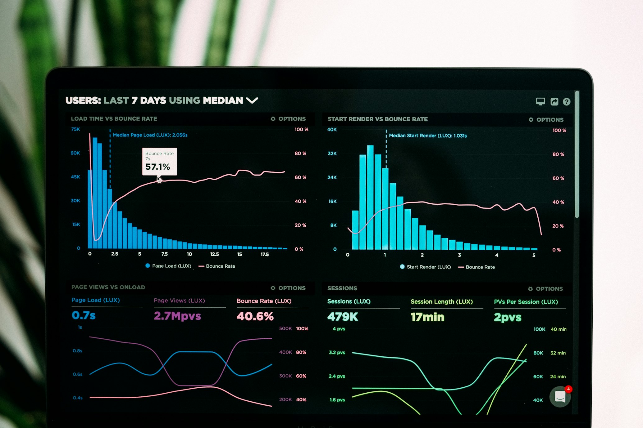
Real-time Dashboard Example
A complete example of building a real-time dashboard that processes streaming data and visualizes it with interactive charts and metrics.

Overview
This example demonstrates how to build a real-time dashboard using Inversion that processes streaming data and visualizes it with interactive charts and metrics. The dashboard provides real-time insights into your data, allowing you to monitor key metrics and make informed decisions quickly.
Features
- Real-time data processing with sub-second latency
- Interactive visualizations that update automatically
- Customizable dashboard layouts
- Support for various data sources (Kafka, Kinesis, MQTT)
- Alerting capabilities for threshold violations
- Historical data comparison
Architecture
The real-time dashboard is built on a modern architecture that separates data ingestion, processing, and visualization:
Data Ingestion
Connects to streaming data sources and ingests data in real-time.
Data Processing
Transforms, aggregates, and enriches data for visualization.
Visualization
Renders data in interactive charts, gauges, and tables.
Implementation
Let's walk through the implementation of the real-time dashboard:
Step 1: Set Up Data Source
First, we'll configure a data source to stream data into our dashboard. In this example, we'll use Kafka as our data source.
// Configure Kafka data source
const dataSource = new inversion.DataSource({
  type: 'kafka',
  config: {
    bootstrapServers: 'kafka:9092',
    groupId: 'dashboard-consumer',
    topics: ['sensor-data'],
    autoOffsetReset: 'latest'
  }
});

// Start consuming data
await dataSource.connect();
Step 2: Process the Data
Next, we'll create a processing pipeline to transform and aggregate the incoming data.
// Create a processing pipeline
const pipeline = new inversion.Pipeline();

// Add transformations
pipeline.addTransformation({
  name: 'filter-valid-readings',
  type: 'filter',
  config: {
    condition: 'temperature > 0 AND temperature < 100'
  }
});

pipeline.addTransformation({
  name: 'enrich-data',
  type: 'enrich',
  config: {
    fields: {
      status: {
        type: 'case',
        expression: 'temperature',
        cases: [
          { when: '< 20', then: 'cold' },
          { when: '< 30', then: 'normal' },
          { default: 'hot' }
        ]
      }
    }
  }
});

pipeline.addTransformation({
  name: 'aggregate-by-location',
  type: 'aggregate',
  config: {
    groupBy: ['location'],
    operations: [
      { field: 'temperature', op: 'avg', as: 'avg_temperature' },
      { field: 'humidity', op: 'avg', as: 'avg_humidity' },
      { field: 'temperature', op: 'max', as: 'max_temperature' }
    ],
    window: {
      type: 'sliding',
      size: '5m',
      slide: '1m'
    }
  }
});

// Connect pipeline to data source
pipeline.setSource(dataSource);
Step 3: Create the Dashboard
Now, let's create the dashboard and add visualizations.
// Create a dashboard
const dashboard = new inversion.Dashboard({
  title: 'Sensor Monitoring Dashboard',
  refreshInterval: 1000 // Refresh every second
});

// Add a time series chart
dashboard.addWidget({
  type: 'time-series',
  title: 'Temperature Over Time',
  position: { x: 0, y: 0, width: 8, height: 4 },
  dataSource: pipeline,
  config: {
    query: 'SELECT timestamp, avg_temperature FROM aggregated_data GROUP BY location',
    xAxis: {
      field: 'timestamp',
      label: 'Time'
    },
    yAxis: {
      field: 'avg_temperature',
      label: 'Temperature (°C)'
    },
    series: {
      groupBy: 'location'
    }
  }
});

// Add a gauge chart
dashboard.addWidget({
  type: 'gauge',
  title: 'Current Temperature',
  position: { x: 8, y: 0, width: 4, height: 4 },
  dataSource: pipeline,
  config: {
    query: 'SELECT avg_temperature FROM aggregated_data WHERE location = "main-facility" LIMIT 1',
    value: {
      field: 'avg_temperature'
    },
    min: 0,
    max: 100,
    thresholds: [
      { value: 20, color: 'blue' },
      { value: 30, color: 'green' },
      { value: 50, color: 'yellow' },
      { value: 80, color: 'red' }
    ]
  }
});

// Add a data table
dashboard.addWidget({
  type: 'table',
  title: 'Sensor Readings by Location',
  position: { x: 0, y: 4, width: 12, height: 4 },
  dataSource: pipeline,
  config: {
    query: 'SELECT location, avg_temperature, avg_humidity, max_temperature, status FROM aggregated_data',
    columns: [
      { field: 'location', label: 'Location' },
      { field: 'avg_temperature', label: 'Avg Temp (°C)', format: 'number', decimals: 1 },
      { field: 'avg_humidity', label: 'Avg Humidity (%)', format: 'number', decimals: 1 },
      { field: 'max_temperature', label: 'Max Temp (°C)', format: 'number', decimals: 1 },
      { field: 'status', label: 'Status' }
    ],
    rowColor: {
      field: 'status',
      mapping: {
        'cold': 'blue',
        'normal': 'green',
        'hot': 'red'
      }
    }
  }
});

// Start the dashboard
await dashboard.start();
Deployment
To deploy the real-time dashboard, you can use Inversion's deployment capabilities:
inversion deploy --type dashboard --name sensor-monitoring
This will deploy your dashboard to Inversion's cloud platform, making it accessible to authorized users through a secure URL.
Resources
Here are some additional resources to help you build your real-time dashboard:
Next Steps
Ready to take your dashboard to the next level? Check out these related examples: